Customer Analytics / Python · Learning project / Case competition
Customer Churn Analysis — IIFT Case Competition
A Python-based customer churn analysis built for the IIFT Samahva case competition — exploring churn drivers through EDA, feature relationships, and classification modelling on customer behavioural data.
- Status
- Competition submission
- Published
- April 2023
- Reading time
- 3 min read
- Project type
- Python & ML
- Complexity
- Low
Built for IIFT Samahva National Analytics Case Competition (1st Runner-Up)
Context
Identifying churn drivers from customer behavioural and demographic features
Focus
Python — EDA, feature analysis, classification pipeline
Stack
Business Question
Which customer characteristics and behaviours predict churn — and how can an organization identify at-risk customers before they leave? This analysis was developed for the Samahva National Analytics Case Competition at IIFT Delhi, where it contributed to a 1st Runner-Up finish.
Data Sources
A customer dataset with behavioural, demographic and service-usage features — contract type, tenure, monthly charges, payment method, service subscriptions, and a binary churn target.
Approach
A Python analysis covering: data loading and profiling, null handling and type correction, exploratory visualization of churn rates across feature categories, correlation analysis to surface the strongest predictors, and a classification pipeline to model churn probability.
Key Steps
- Data profiling — shape, dtypes, null counts, churn rate baseline
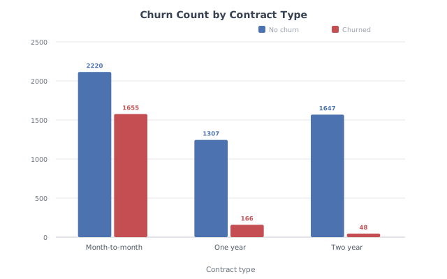
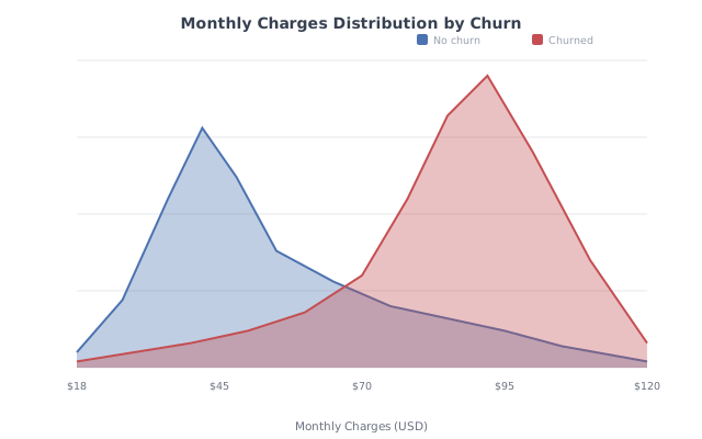
- EDA — churn by contract type (month-to-month vs annual), tenure band, payment method, and monthly charge distribution using seaborn
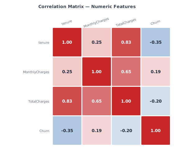
- Feature relationships — correlation matrix and pairplots to identify multicollinearity and the strongest individual predictors
- Modelling — classification pipeline (logistic regression baseline + tree-based comparison), evaluation via confusion matrix and classification report
- Insight synthesis — translating model outputs into actionable segment descriptions for the competition presentation
The notebook below walks through the actual pipeline — EDA cells through to the model's classification report.
(7043, 21)
No     0.7346
Yes    0.2654
Name: Churn, dtype: float64
              precision    recall  f1-score   support

    No churn       0.85      0.89      0.87      1294
     Churned       0.65      0.56      0.60       467

    accuracy                           0.81      1761
   macro avg       0.75      0.73      0.74      1761
weighted avg       0.80      0.81      0.80      1761
Key Findings
Month-to-month contract customers showed significantly higher churn rates than annual subscribers — the single strongest categorical predictor. Customers with shorter tenure and higher monthly charges relative to their service bundle were disproportionately represented in the churned group. Payment method also showed a pattern: customers on electronic check payments churned at higher rates than those on automatic bank transfers.
Technologies I Personally Used
Python
Analysis
Lessons Learned
- EDA before modelling is not just good practice — it's where the business insight actually lives; the model confirmed what the distributions already showed
- For a competition setting, the presentation of findings matters as much as the analysis; translating a confusion matrix into "we can correctly flag 8 in 10 at-risk customers" was more useful to the judges than raw accuracy numbers
- Segment descriptions (not just predictions) give business teams something to act on
Reflection
What I learned: analytical rigour and business clarity are two different skills — this competition forced me to develop both simultaneously under time pressure.
What I would improve today: survival analysis (time-to-churn) for the tenure variable, and a proper validation framework rather than a single train/test split.
Competition context: Samahva National Analytics Case Competition, IIFT Delhi — SRCC-GBO team finished 1st Runner-Up.
Related work
R&D & Marketing Intelligence
News & Tender Intelligence Portal
An internal intelligence portal that automates news and tender monitoring for R&D and Marketing, replacing fragmented manual searches with a centralized, keyword-driven workflow.
Field Operations & Supply Chain
Seaweed Digital Platform
A mobile-first field platform digitizing seaweed collection operations across 30+ coastal sites — offline-first collection capture, field hierarchy, species-wise targets and daily operational visibility. Vendor-developed; I own it functionally end to end.