Business Intelligence & Analytics · Agri-processing / Manufacturing
Business Insights Dashboard
A centralized Power BI decision-support tool giving leadership a single source of truth across Sales, Receivables, Inventory and Procurement — replacing fragmented, function-by-function Excel reporting.
- Status
- Live and actively used
- Published
- June 2025
- Reading time
- 5 min read
- Project type
- Executive decision-support dashboard
- Complexity
- High
Centralized from fragmented Excel reports
Reporting
Single source of truth for leadership reviews
Visibility
Business impact is currently being quantified and will be updated as validated metrics become available.
Quantified impact
Business Question
Leadership needed a single source of truth to monitor business performance across multiple functions and identify trends, risks and opportunities — without relying on multiple Excel reports pulled together from different teams on different schedules. The dashboard was built to answer questions leadership was already asking in review meetings, including:
- How are Sales, Receivables, Inventory and Procurement performing?
- Which customers are being lost?
- Which products and business segments are growing or declining?
- Where are revenue concentration risks?
- Which regions, products or teams require management attention?
- What should leadership prioritize based on current business performance?
Data Sources
The dashboard consolidated data from multiple business sources, including Microsoft Dynamics 365 Business Central (ERP), Excel-based operational reports, sales datasets, receivables data, inventory data, procurement data, customer master and transaction data, and business review datasets. This case study describes those sources at a business level rather than the underlying database architecture, which isn't mine to publish.
KPIs
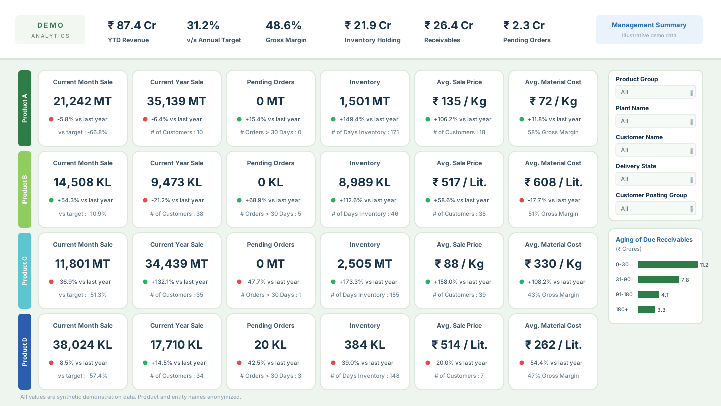
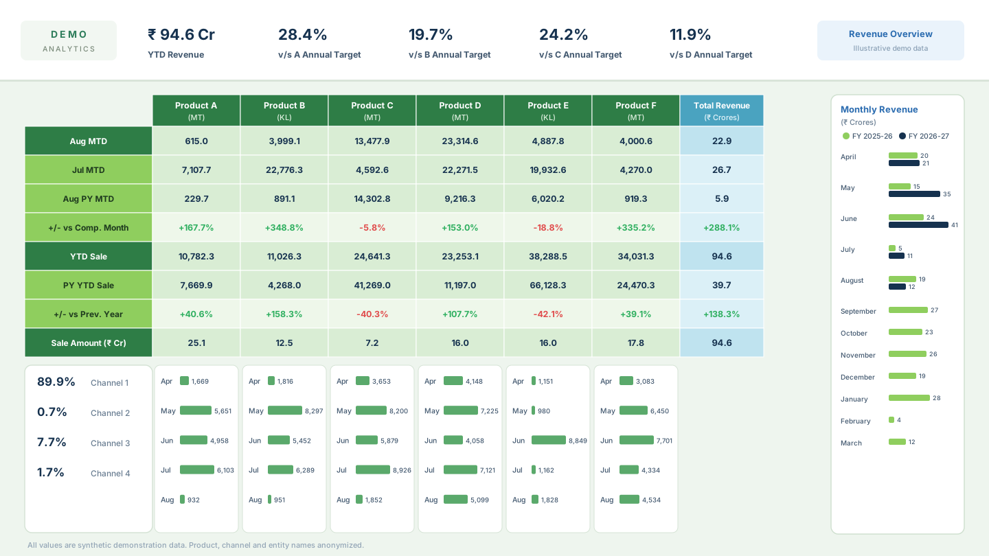
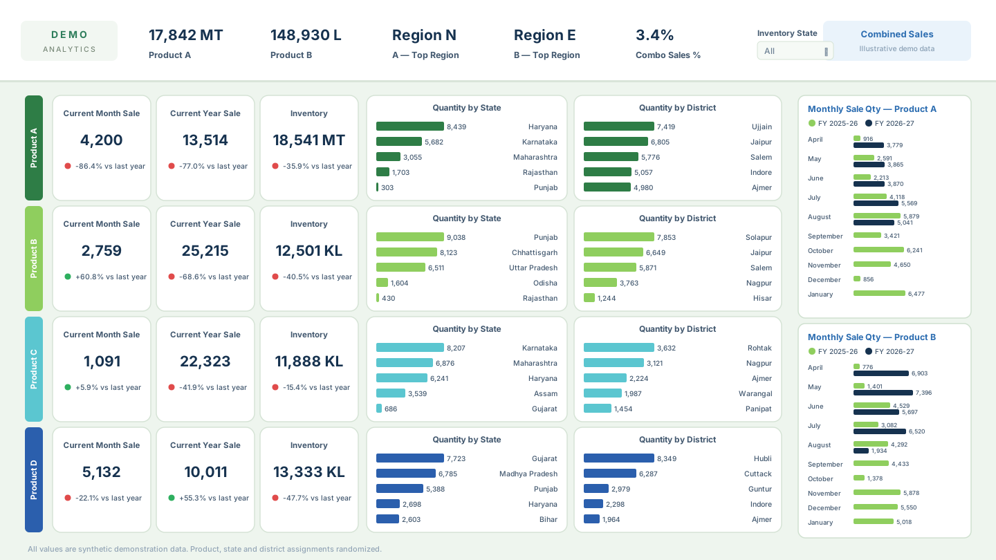
The dashboard tracked KPIs across every function leadership reviewed regularly: sales performance, customer-wise and product-wise sales, vendor-wise analysis, inventory position, receivables status, procurement performance, lost customers, customer recovery opportunities, revenue concentration, trend analysis, and stock cost analysis.
Dashboard Design
I designed and developed the dashboard in Power BI. The focus throughout was making executive decision-making easier, not just displaying more data:
- Organizing KPIs into logical business sections instead of one undifferentiated report
- Building drill-down capability so a summary number could be interrogated without a separate ad-hoc request
- Improving usability specifically for leadership review meetings, where time to answer a question matters
- Designing visualizations that highlighted trends rather than only showing raw numbers
- Making reports easier to interpret in the room during management discussions, not just after the fact
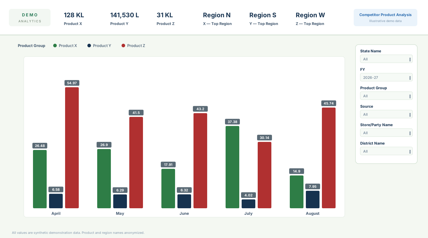
The views below are faithful recreations of the actual dashboard system, rebuilt entirely with synthetic demonstration data — every value is randomly generated and all product, customer, channel and region names are anonymized to protect company confidentiality.
Key Responsibilities
- Understanding business requirements from leadership and business teams
- Identifying the KPIs required for executive reviews
- Designing and developing the Power BI dashboard
- Performing data validation and quality checks
- Translating business questions into analytical views
- Building customer-wise, product-wise and vendor-wise analysis
- Conducting lost customer analysis and identifying recovery opportunities
- Performing stock cost analysis
- Supporting leadership through ad-hoc analytical requests
- Continuously enhancing the dashboard based on stakeholder feedback
Technologies I Personally Used
Analytics & BI
Business & stakeholder
Quality & insight
Insights
The dashboard surfaced several strategic insights that weren't visible when reporting was fragmented across separate spreadsheets: customer churn and lost-customer patterns, revenue concentration among a limited customer base, pricing gaps across business segments, product performance trends, vendor and inventory trends, opportunities for customer recovery, and stock cost optimization opportunities.
Business Decisions
Insights from the dashboard supported management discussions around customer reactivation initiatives, pricing strategy improvements, better prioritization of key accounts, inventory and stock reviews, ongoing sales performance monitoring, and business review meetings more broadly — giving those conversations a shared, current view of performance instead of reconciling separate reports first.
One concrete example: identifying lost customers and the commercial opportunity they represented directly supported customer reactivation initiatives and fed into improvements in pricing strategy.
Business Impact
Centralized from fragmented Excel reports
Reporting
Single source of truth for leadership reviews
Visibility
Business impact is currently being quantified and will be updated as validated metrics become available.
Quantified impact
The dashboard became a centralized decision-support tool for leadership. It improved visibility into business performance, reduced dependence on fragmented reporting, and enabled faster analytical reviews. Business impact is currently being quantified and will be updated as validated metrics become available.
Lessons Learned
- Executive dashboards succeed by answering business questions, not by displaying more data
- KPI selection matters more than visualization complexity — the right five numbers beat twenty well-designed charts
- Close collaboration with stakeholders significantly improves dashboard adoption
- Data quality directly shapes how much leadership trusts the analytics, independent of how the dashboard looks
Reflection
What I learned: this project reinforced that executive tools succeed on KPI selection and clarity, not visual sophistication — adoption came from answering leadership's actual questions, not from adding more charts.
What I would improve today: I'd push for structured stakeholder review checkpoints built into the design phase, rather than relying mainly on feedback after launch to catch gaps.
How I would approach this differently today: with the tooling available now, I'd build the semantic model in Microsoft Fabric, introduce automated data pipelines instead of manual refresh dependencies, integrate Power Automate for alerts and report distribution, add AI-assisted insight generation, and explore conversational analytics so leadership could ask questions in natural language directly.
Future enhancements: reducing manual dependencies through the automation above, and validating the quantified business impact figures as they become available.
Related work
R&D & Marketing Intelligence
News & Tender Intelligence Portal
An internal intelligence portal that automates news and tender monitoring for R&D and Marketing, replacing fragmented manual searches with a centralized, keyword-driven workflow.
Field Operations & Supply Chain
Seaweed Digital Platform
A mobile-first field platform digitizing seaweed collection operations across 30+ coastal sites — offline-first collection capture, field hierarchy, species-wise targets and daily operational visibility. Vendor-developed; I own it functionally end to end.